Color Picker Component, A Beautiful Color Selector
This article was previously published in the 2022 IT Ironman Competition - Turning Interesting Ideas into Apps with SwiftUI
Apple’s Documentation on Color Picker
https://developer.apple.com/documentation/swiftui/colorpicker
The Color Picker is one of my favorite SwiftUI components. If you were to manually create this component using UIKit, it would be time-consuming. Previously, if such a requirement arose, we generally resorted to third-party libraries. Now, with SwiftUI, this component is readily available, and it can be used on iOS 14+ versions. For selecting colors, you can use gridlines, a spectrum, or sliders, making it both beautiful and convenient.
Let’s now make a test project: a backwards clock dial with a splash of color.
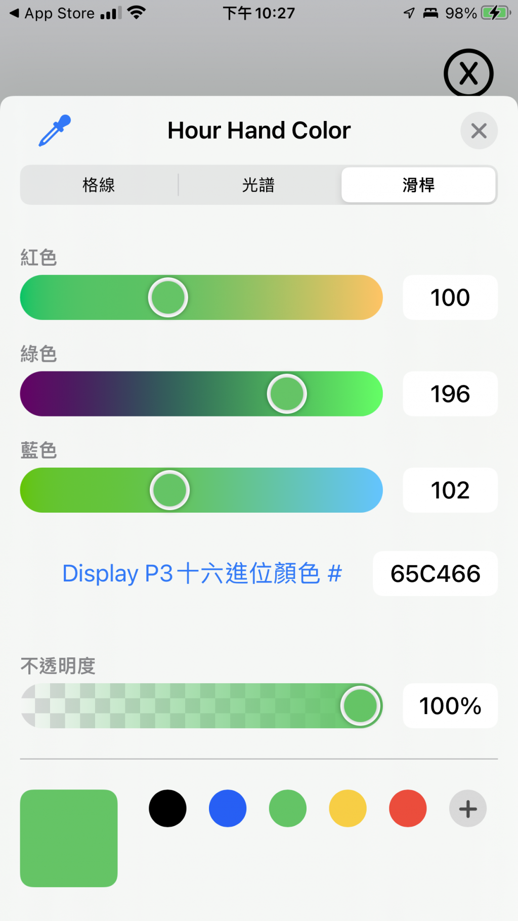
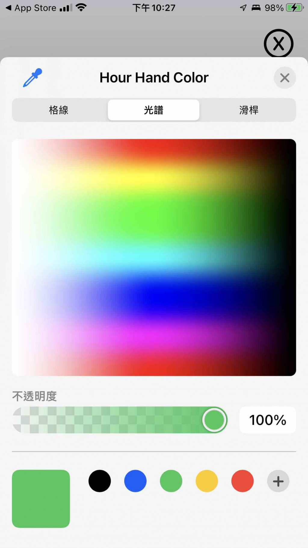
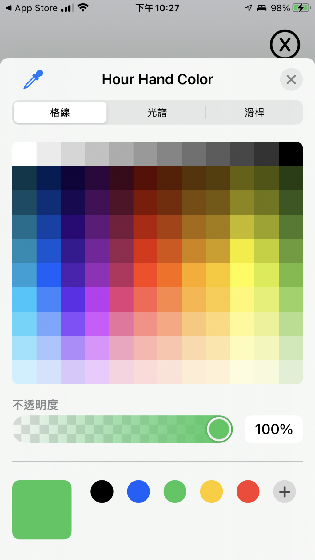
Introducing ColorPickerContainerView
The ColorPicker requires a Binding parameter, designed to let the outer part (the page with the clock) pass in the color, which then updates the color of the dial externally.
struct ColorPickerContainerView: View {

  @Binding var dialColor: Color

  var body: some View {

    ColorPicker("Dial Color", selection: $dialColor)
      .padding()
  }
}

struct ColorPickerContainerView_Previews: PreviewProvider {

  @State static var previewDialColor: Color = .white

  static var previews: some View {
    ColorPickerContainerView(dialColor: $previewDialColor)
  }
}
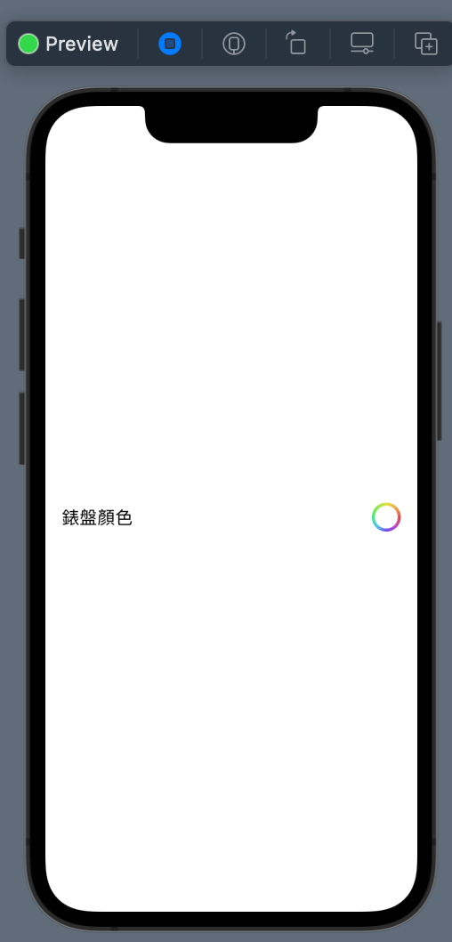
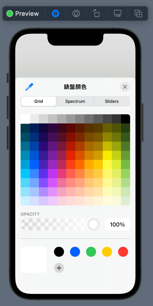
Even in the preview, pressing the action button brings up the color palette.
Modifying the Dial, Allowing the Dial Color to Change
Add a dialColor to allow the color to be changed. Below the original Circle().stroke(), add another dial layer, which is the part that actually changes color.
struct ClockDialView: View {

  @Binding var dialColor: Color

  var tickLength: CGFloat = 5

  var body: some View {

    ZStack {
      /// The part that actually changes color
      Circle()
        .fill(dialColor)
        .padding(3)
      /// The outer frame
      Circle()
        .stroke()
        .padding(3)

      ticks
        .padding(3)

      HStack {
        Spacer()
        BackwardsClockNumberView()
        Spacer()
      }
    }
  }

  private func isLongTick(_ position: Int) -> Bool {
    return position % 5 == 0
  }

  var ticks: some View {

    ForEach(0..<60) { position in
      let longerTick = tickLength * 1.8

      Tick(tickLength: isLongTick(position) ? longerTick : tickLength )
        .stroke(lineWidth: 3)
        .rotationEffect(.radians(Double.pi * 2 / 60 * Double(position)))
    }
  }
}

struct ClockDialView_Previews: PreviewProvider {

  @State static var dialColor: Color = .green

  static var previews: some View {
    ClockDialView(dialColor: $dialColor, tickLength: 5)
      .frame(width: 200, height: 200, alignment: .center)
  }
}
Bringing Up the Color Selector on the Clock Page
First, add a file named ColorPickerContainer.
Next to the original wiki page button, place a settings button.
struct ClockContainerView: View {

  var width: CGFloat = 200
  var height: CGFloat = 200

  @StateObject private var clockwork: Clockwork = .init()

  @State private var dialColor: Color = .white

  @State private var isShowingGraceWikiSheet = false

  @State private var isShowingColorPicker = false

  private let graceWikiPageURL = "https://en.wikipedia.org/wiki/Grace_Hopper"

  private let angleUtility: AngleUtility = .init()

  var body: some View {
    ZStack {

      VStack {
        HStack {
          Spacer()
          wikiProfileButton
          settingButton
            .padding(.trailing, 5)
        }
        Spacer()
      }

      Group {
        ClockDialView(dialColor: $dialColor)
        HandShape(handLength: .hour)
          .fill(Color.blue)
          .rotationEffect(Angle(degrees: clockwork.hourAngle))
        HandShape(handLength: .minute)
          .fill(Color.cyan)
          .rotationEffect(Angle(degrees: clockwork.minuteAngle))
        HandShape(handLength: .second)
          .fill(Color.red)
          .rotationEffect(Angle(degrees: clockwork.secondAngle))
        Circle()
          .fill(Color.orange)
          .frame(width: 20, height: 20, alignment: .center)
      }
      .frame(width: width, height: height, alignment: .center)
    }
  }
  /// Extract the wiki profile button
  private var wikiProfileButton: some View {
    Button {

      isShowingGraceWikiSheet.toggle()
    } label: {
      Image(systemName: "person.crop.circle")
        .font(.system(size: 50))
        .foregroundColor(.black)
    }
    .sheet(isPresented: $isShowingGraceWikiSheet) {
      BCWebView(urlString: graceWikiPageURL)
    }
  }
  /// Extract the settings button
  private var settingButton: some View {

    Button {

      isShowingColorPicker.toggle()
    } label: {
      Image(systemName: "gearshape.circle")
        .font(.system(size: 50))
        .foregroundColor(.black)
    }
    .sheet(isPresented: $isShowingColorPicker) {
      ColorPickerContainerView(dialColor: $dialColor)
    }
  }
}
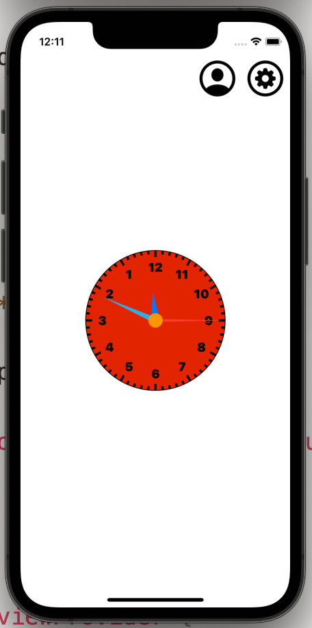
The dial color change functionality is complete.
If you want to change the color of the hands, the process is similar.
Deployed App on App Store
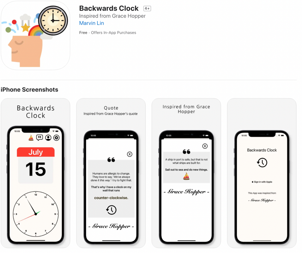
This clock app was later developed into a version that was published on the App Store, integrating Firebase and RevenueCat. The total size is only 5.1 MB. SwiftUI really impressed me!
https://apps.apple.com/backwards-clock/id1632935212
Related Documentation
https://developer.apple.com/documentation/swiftui/colorpicker
