
Where to place the main action in alerts? Left or Right? (For Apple OS, place it on the right (i.e., at the end))
Where should the main action be placed in alerts? Left or Right? Alerts are a common user feedback mechanism that notifies users about what is happening or requires them to make some decisions. Alerts usually have one or more option buttons that allow users to choose actions like accept, cancel, confirm, ignore, etc. So, where should these option buttons be placed in alerts? On the left or the right?

If there is a design document for the platform, please consult it first
Apple’s design guideline: Main action should be placed on the right (at the end)
Main action should be placed on the right (at the end)
This is outlined in Apple’s design documentation where it discusses the placement of buttons.
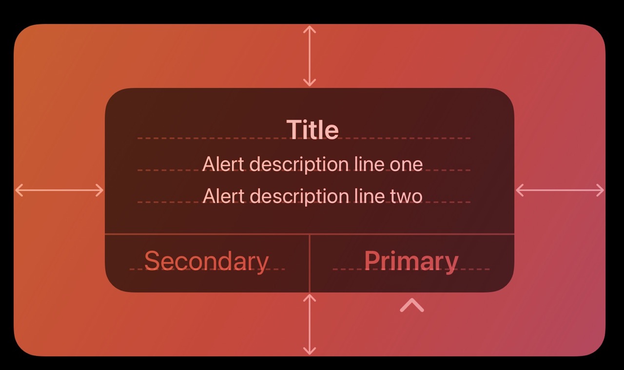
Place buttons where people expect them. Generally, place the button that people are most likely to choose on the trailing side in a row of buttons or at the top in a stack of buttons. Always place the default button on the trailing side of a row or at the top of a stack. Cancel buttons are typically on the leading side of a row or at the bottom of a stack.
Apple’s documentation states that buttons should be placed where users expect them. Typically, the button that users are most likely to choose should be placed at the end of a row of buttons or at the top of a stack of buttons. Likewise, the default button should be placed on the trailing side of a row or at the top of a stack. Cancel buttons are usually located on the leading side of a row or at the bottom of a stack. If you look at each of Apple’s default apps, like “Settings” or “Weather,” they all follow this design document.
Why Apple places the main action button at the end
According to an article by the Nielsen Norman Group, placing the main action at the last position can make the dialogue flow more smoothly because it concludes with a resolution. Similarly, you can consider the main action as the option for users to proceed, and the cancel as the option for users to go back. Thus, placing the main action in the same position as the next step, on the right side, makes the user interaction more intuitive and natural.
Other considerations for Alerts
Create succinct, logical button titles. Aim for a one- or two-word title that describes the result of selecting the button. Prefer verbs and verb phrases that relate directly to the alert’s text—for example, “View All,” “Reply,” or “Ignore.” In informational alerts only, you can use “OK” for acceptance, avoiding “Yes” and “No.” Always use “Cancel” to title a button that cancels the alert’s action. As with all button titles, use title-style capitalization and no ending punctuation.
Avoid using OK as the default button title unless the alert is purely informational. The meaning of “OK” can be unclear even in alerts that ask people to confirm that they want to do something. For example, does “OK” mean “OK, I want to complete the action” or “OK, I now understand the negative results my action would have caused”? A specific button title like “Erase,” “Convert,” “Clear,” or “Delete” helps people understand the action they’re taking.
Choose concise and easy-to-understand button titles. Preferably, use a one or two-word title that describes the result of selecting the button. Prioritize verbs and verb phrases that directly relate to the alert content, such as “View All,” “Reply,” or “Ignore.” In informational alerts, you can use “OK” to indicate acceptance, rather than “Yes” or “No.” Always label a button that cancels an alert’s action as “Cancel.” As with all button titles, use title-style capitalization without any ending punctuation.
Unless the alert is purely informational, avoid using “OK” as the default button title. The meaning of “OK” can be ambiguous even in alerts that ask users to confirm an action. For example, does “OK” mean “OK, I want to complete the action” or “OK, I now understand the negative consequences my action would have caused”? Using a specific button title like “Erase,” “Convert,” “Clear,” or “Delete” helps users understand the action they are taking.
Also Featuring Android’s Dialog Guidelines
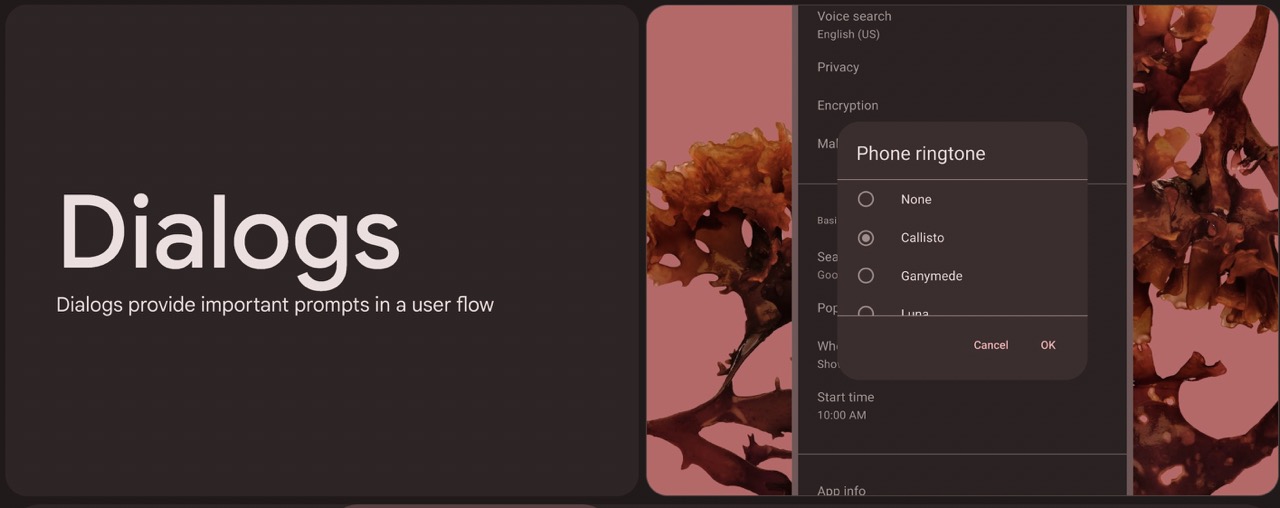
In Android’s material design, the primary action in dialogs is also placed on the right side.
Reference URLs
Apple’s Documentation on Alerts